Hi, not sure if this has been on the radar but I have many charts that I want to include in our annual sales meetings. I hoped to export or screenshot the chart but without labels its not very viewer friendly as an image.
Would it be possible to have the labels visible without hovering over each bar or pie?
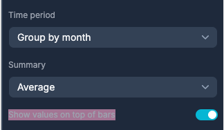
Currently the chart exports as below, Id love to show the values without hover.
Here’s a very quick one I’ve done in Excel where I can have the option to show data labels if I choose to. I can also customise the colour and font size or choose whether it displays inside the bar or at the top.
In addition being able to add custom colours to the bars is very important. It’s an issue I’ve run into with the current system we use and the colours don’t fully represent the values e.g. If something is’ complete’ or ‘closed’ it should be green or ‘in progress’ should be ‘yellow’ etc. We don’t want to have instances where something could show green when it’s maybe overdue or something like that. Ideally showing the bar colours based on the values in the data source would be great.
Regarding the colours @darragh , I was trying to take one of the preset blue colours and change it to #c93879, spent hours trying to add my own css to match our brand but just cant find the selector for it, due to my lack of knowledge now doubt
Maybe an option in app settings to create your own brand scheme colours, something like Canva do. Then apply this to certain charts, buttons etc.