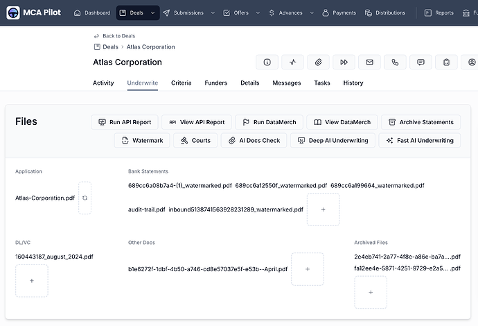
Hi, some of my users prefer the File Names display format rather than the Thumbnail, because they can all their file names at a glance instead of having to hover over the little sqaures.
However, the UI makes it quite difficult to tell the files apart. As you see in the screenshot below, the file names on the same line all blend in and look like 1 file name:
Would be great if we can have a pill / tag / badge design where each is easily discernible, similar to how linked fields are displayed:
Also, currently there is no way to change the file display format for an update modal within an action button. We can only choose between Default and Esignature:
Would love to be able to use the File Names display format in update modals as well.


