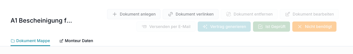
Suggestion:
Either give Button their own row below the Title/Subtitle or allow them to be collapsed into a Menu.
Ideally, you can choose how to do it. For records with just 1-2 Buttons, it’s probably nice to see them directly, for records with many buttons, a menu is probably better.
So I noticed this has been implemented which is awesome! It feels like now you can actually use the overlays.
However there is one big issue still: It seems like the width is now dynamic, so on my 27” screen the overlay is nice and wide but on my Laptop screen is still tiny. Could you make the width fixed or give it a min width of at least the standard container width?
Right now I still cannot adjust the layouts for the bigger width because all layouts will be broken once someone uses the app on a laptop.